Provider Dashboard
The Provider Dashboard for Solo is displayed when the user selects the role of Practitioner. It provides information about news, your schedule for the day, activity statistics, and more, andIt is divided into four (4) sections; a left navigation, a middle, and right panel; and a tool bar on top of the page.
Note: The mobile App is responsive; with floating panels for smaller screen.
Note: See the MA-20165 Practice Admin User Guide.

The elements of the user interface are:
- Teladoc Health logo: Click the logo to return to the start page from any page. White-labelled users will have their logo display.
- Search: Enter a patient's name, or ID, to search for a patient. When a patient's name is selected, the middle panel will populate with a list of patient names that match your entry. An Advanced search option allows a list of ALL patientsl. The Filter feature on the right panel allows you to narrow your search.
- User Role: Use the dropdown to select your role of Practitioner.
- User Icon: Select the user icon to activate its dropdown menu.
- Profile: Manage your user profile settings.
- Settings: View and configure your user settings.
- Pre-call diagnostics: Test and verify your audio and video connection.
- Support: Access the Teladoc Health online support page.
- Log out: Log out.
- Left Navigation Panel: Select the Teladoc Health logo from the upper, left corner of the screen. The following options are available. The listed topics do not include the software modules of Smart Notes, Imaging, and Analytics, which are sold separately.
- Queue
- Care Locations
- Encounters
- Services
- Middle Panel: The middle panel provides the content for the topic you selected from the left navigation panel. The default is a list of Services.
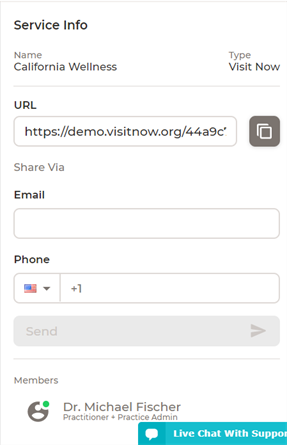
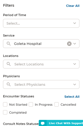
- Right Panel: The right panel provides the content for the topic you selected from the left and middle navigation panels. It is referred to as the Patient panel when patient information, Services Info when Services is selected, and a Filter when Show Filters is enabled.
- Live Chat: Select for live chat support.

NOTE: The filter parameters change according to your selection on the left navigation and middle panels.


Online Status
A colored circle on the User Icon indicates your connection status. Manually change your status by clicking on the colored circle. Your status will change to busy automatically when you are in a sessionr

The status colors are:
| Color | Definition |
| Green | Online and Available |
| Magenta | Online and Busy |
| Gray | Offline |
The options are:
Note: Services are only available for the Consumer workflow.
| Services | Filters |
|---|---|
|
|